PhotoCompare
Using Machine Learning to connect Ancestry users with their family photos. How can we encourage users to upload photos to the Ancestry mobile app?
Jump to PrototypesDevices
Mobile Native (iOS + Android)
Role
UX Designer (team project with 2 iOS + 2 Android developers and 1 PM intern)
Skills
Product Design, UX Research, User Interviews, Cross-functional collaboration, Prototyping
Ancestry is the place where those curious about their family history embark on journeys of personal discovery.
This is a project I worked on during my time at Ancestry as a UX intern in the Mobile department. Ancestry had a business goal of increasing UGC (user generated content). My team was tasked with creating a feature to help achieve this goal.
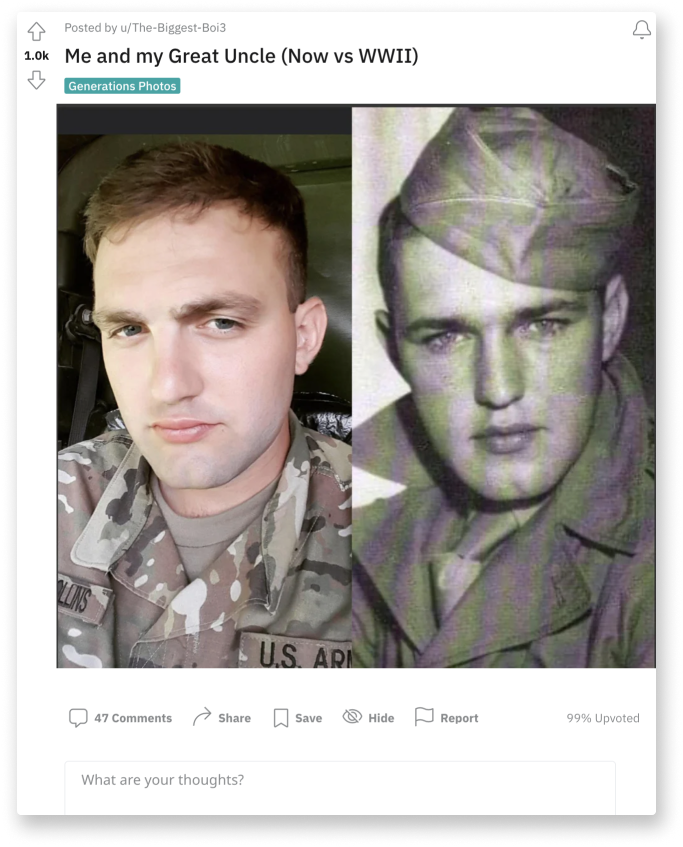
Trends have taken off on social media - leaving the app behind.
After digging into social media trends related to the Ancestry platform, we found an abundance of users posting side-by-side comparisons of themselves with images of their ancestors that they discovered in their family tree. This trend spanned across many social media platforms from facebook pages to reddit threads. The problem was, all of this buzz was taking place outside of the Ancestry mobile app.

Finding a photo...
is one of the most exciting and endearing moments a user can experience while using the Ancestry app. We want to capitalize on this event in the user’s experience. What if user’s could compare photos of themselves with their ancestors directly in the app? This would bring a lighthearted element to the platform as well as help reach our business goal.
Taking it a step farther with technology…
Using Apple Vision framework API on iOS and AWS machine learning implementation on Android, we were able to calculate a similarity “score” or percentage between two photos. We decided to implement the idea of a similarity score into our feature to take it to the next level. Users could discover just how similar they really are to their relatives.

Requirements
- Ability to compare two images for a similarity score (calculated by Apple Vision framework API or AWS machine learning implementation).
- Provide the ability to add an image for comparison from the Ancestry gallery or upload/take your own.
- Users can start a comparison from an image in their Ancestry gallery or start from a blank template
- Users can save their results or share them to social media and friends.
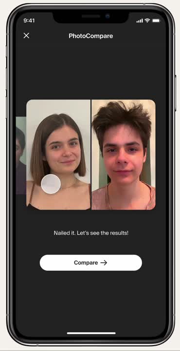
UI Creation - PhotoCompare
Designing the user interface for PhotoCompare was a unique and exciting challenge. My UI designs derived from the "dark mode" state in similar in-app experiences that have to do with content creation and photos - this created continuity in the user experience. The story-builder and the image viewer both use grey and black tones, with a minimalistic layout. I implemented design treatments of my own as well as incorporating elements from the Ancestry design system.
I designed and prototyped the user-flow for comparing two images for a similarity score. The ability to upload your own photos from your camera or personal gallery was considered as well.

Feature Access Points
Where will PhotoCompare live? How will users reach it?
My product manager and I collaborated to study user data and the information architecture of the Ancestry mobile app when deciding how users will access the PhotoCompare feature. We decided on three different access points - some are based on screen traffic, others on where users will navigate when working with or viewing photos.
1. Discover Feed
The Discovery feed is a highly trafficked area in the app and is a hotspot to advertise new features and updates.
2. Image Viewer
When a user clicks on an image, they are brought to this view. They can go straight to the PhotoCompare feature from here.
3. Media Gallery
Where any images found in a family tree are stored. The FAB holds possible actions that a user can take - PhotoCompare being added to the list.
Learning how to work together efficiently - Teamwork makes the dream work.
Working with a team of developers is something I truly enjoy after my experience with this project. My team and I learned each-other's working styles and how to best get the job done quickly and correctly. Efficiency was paramount due to our strict timeline. Leaving redline guidelines in my handoff files worked best for my team and significantly reduced tedious back-and-forth. I utilized Ancestry's design tokens and spacing standards to communicate.
Requirements
- Ability to compare one image versus two, providing similarity scores for both images and displaying a "winner".
- Provide the ability to add an images for comparison from the ancestry gallery or upload/take your own.
- Users can start a comparison from an image in their ancestry gallery or from a blank template.
- Users can save their results or share them to social media and friends.
Who Looks more Alike?
After creating the compare 2 images feature, my team wanted to keep pushing and take our feature to the next level.
Product management suggested the ability to compare multiple images at one time - from this I developed the concept of comparing one image versus two. I maintained the visual style from our first mode of comparison but took a more bold approach with the interaction design, adding animations for user delight.

My Product Manager and I collaborated with the User Experience Research department at Ancestry to create a research plan for our feature. We conducted interviews and prototype walkthroughs with 20+ real Ancestry users from a variety of demographics after drafting an intentional user interview script.
Our research goals: gage user interest and emotional reaction to our feature, reveal any usability concerns with our current UI, and decide on the need for both of our modes of comparison.
The Good:
- Users were delighted by the concept, and expressed interest in trying it out.
- There was a positive reaction to BOTH modes of comparison.
The Bad:
- Users expressed concerns over receiving a low similarity score. They noted that receiving a low score might upset them and leave them feeling isolated from their family or heritage.
The Solution:
Display different copy based on similarity score range to keep the feature lighthearted.
Learning that users would feel dejected if they received a low similarity score when comparing themselves with an ancestor was concerning. Our goal for PhotoCompare was to create a fun and delightful feature and we decided to address these user concerns by consulting the Ancestry copywriting department.
We created three different text outputs based on the ranges of similarity scores received, and made sure our copy was playful to remove any element of seriousness. Users who received a low score would be encouraged to try again or start a new comparison.
Compare 2 Images - Prototype
Check out the original mode of comparison in action with a photo of my 2nd great grandmother.
Who Looks more Alike?- Prototype
View the prototype for comparing one image against two - with a great example using photos from my teammates tree!
***The entirety of this feature was implemented in code, ready to ship, for iOS and Android by the amazing developers on my team***
PhotoCompare Team
UX Design: Kayleigh Ground (that's me!)
Product Management: Shahreen Hossain
iOS Development: Sima Nerush, Fiona L.
Android Development: Anant Pundir, Akshay Sahai
What I learned for my career as a UX designer...
Hard work speaks for itself, but presentation skills are a necessity.
When creating a feature from square one, you can often get lost in the work. All of the details might seem obvious, but learning how to explain and sell your feature to someone outside the work is key. When my team presented PhotoCompare to a panel of executives, we learned many valuable skills about presentation - often times its better to create a narrative story rather than focus on technical details.
Learn how your teammates work best, and create a recipe for success.
Everyone has a different working style. I learned that the best teams learn how to work together, and learn to understand each other. My team found great success when we took the time to understand each others strengths and habits.
The more opinions and feedback, the better.
Working in a large company exposed me to many different departments and a wonderful array of feedback and opinions. I learned to seek out advice and help from not only my UX mentors, but developers, PMs, UX copywriters, UX researchers and more while working on this feature. Utilizing mentors and a diverse set of opinions and knowledge is extremely valuable.

The team behind PhotoCompare looking cute as always ☺︎.
Presenting PhotoCompare to an executive panel and an audience of 40+ employees.

Want to learn more about this project?
I'd love to chat - shoot me an email! kayleighg.design@gmail.com